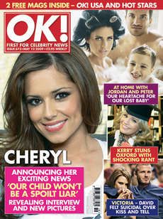
The mast head is in the left hand corner of the magazine so when the magazine is in stores on the shelf and is behind other magazine it can be easily spotted by the reader. The mast head is wrote in white which makes it stand out from the bright red background that it is on top of giving the mast head a clear standing out view of the magazine. They use the colours red for the mast head because it attracts the audience as it gives a sign of alert in the readers head. You will see this with other gossip magazines such as "Heat" they use read because its what the human brain is most attracted to. This is a house style for this magazine as throughout it they use the red from the background on where the mast head is, I have started to notice that the house style colours are used all the way through the "OK!" magazine but not on the contents pages which they tend to use the colours pink and purple so the magazine contradicts itself very well here by not using the house colours.
The large image has been used as the background in this magazine and this runs with "OK!" house style they will more than likely use there main story lines image as the background of the magazine. Usually they use a celebrity which is really well know and popular in the news around this time also they will usually use a girl which women would like to look/act like and is a role model to them. In okay as there main image they will usually use a celebrity that have juicy gossip about them and is in the news a lot at the time the magazine goes into stores. The main cover line is sat on top of the main image giving you more information on why they celebrity is the hottest topic in the magazine. This magazine write there main cover lines and extra cover lines in red boxes to match the mast head going along withe the house style once again.
They also do this with other cover lines and use puffs within them to engage the reader.
The strap line for the "OK!" magazine runs under the mast head giving the reader the attraction. I have found that for the "OK!" magazine one of the biggest selling points is the puffs. I think that the puffs are one of the biggest selling points in the "OK!" magazine because they are highlighted in yellow making them stand out from the rest of the text and images that are used on the front cover of the magazine they use words like "new" and "exclusive". They have to used these words to persuade the reader to buy the magazine and see the new things that not many people have seen before. The font which has been used on the front cover is sans serif they have used this font because the target audience is not always just aimed at females some males do like it and enjoy reading it. The font which has been used also fits in right with the format of writing as it is informal but not as informal as other magazine it has no use of slang words in this magazine making the magazine look and seem more formal.
No comments:
Post a Comment